1️⃣ What Is Data Visualization?
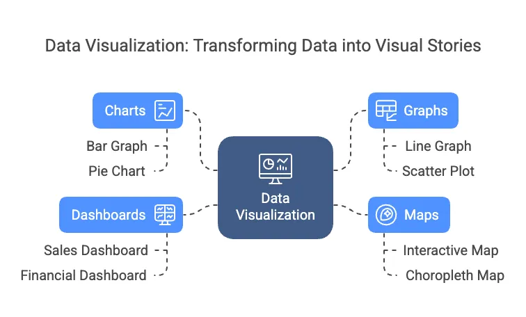
Data Visualization is the process of turning raw data into visual stories — using charts, graphs, maps, and dashboards — so that information is easier to understand, explore, and act on.
Think of it like translating numbers into pictures. Just as a map helps you navigate a new city faster than written directions, a good data visualization helps people spot patterns, trends, and insights at a glance — without needing to dig through spreadsheets.
Key Examples:
- A sales dashboard in Google Data Studio showing real-time revenue by region
- A bar graph in Excel tracking monthly expenses
- An interactive map in Tableau displaying customer locations
- An infographic summarizing survey results for social media
Data Visualization is essential in today’s digital economy because companies run on data — but humans make decisions visually. It's a skill that bridges the gap between technical data and real-world action.
2️⃣ Why It Matters in 2025 and Beyond
Data Visualization is becoming a core business skill as companies generate more data than ever before. In a world of information overload, visual storytelling helps businesses move faster and make smarter decisions. This skill is now critical for standing out in the job market.
In 2025 and beyond, organizations expect employees — not just data teams — to communicate insights visually. Remote work and global teams rely heavily on dashboards and reports that cut through complexity. Data Visualization skills increase job security, freelancing potential, and entrepreneurial success.
The global data visualization market is projected to reach $19.2 billion by 2027, growing at a CAGR of 10.2% from 2020.
- MarketsandMarkets
Why It’s Important
✅ Speeds up decision-making with clear visual reporting.
✅ Increases demand for non-technical roles with data skills.
✅ Creates remote-friendly, client-ready reports and dashboards.
✅ Opens career paths in marketing, product, operations, and consulting.
💡 Industry Spotlight
- Marketing Agencies: Use dashboards to report on ad performance, social media metrics, and ROI for clients.
- Healthcare: Visualize patient data, resource allocation, and predictive trends for faster medical decisions.
3️⃣ Real-World Applications
Data Visualization solves critical problems like reducing manual reporting, making data easy to understand for non-technical audiences, and speeding up business decision-making. It turns complex information into actionable insights across industries — making it a must-have skill for the future of work.
4️⃣ Who Should Learn This Skill?
This skill is perfect for:
✅ Career changers looking to move into tech, marketing, or data roles without needing advanced technical skills.
✅ Entrepreneurs who need to present clear data insights to investors, customers, or team members without hiring expensive analysts.
✅ Freelancers offering data reporting, dashboard creation, or visual content services to clients in marketing, finance, or e-commerce.
✅ Marketing professionals who want to level up from basic reporting to advanced data storytelling for campaigns and clients.
✅ Operations and HR managers who need to simplify internal reporting, track KPIs, and present data to leadership.
Data Visualization is an ideal entry point into tech because it focuses on communication over coding. Many professionals feel stuck in jobs where they handle data but struggle to present it clearly — this skill breaks that barrier. It empowers people to create real business value fast, making them more competitive in the job market and more valuable to employers or clients.
5️⃣ How Hard Is It to Learn?
Data Visualization is one of the most beginner-friendly digital skills — especially because many tools are designed for non-technical users. The key is learning how to structure your data, choose the right visuals, and tell a clear story. Mastery comes from practice through real projects.
Here’s a realistic learning roadmap:
💡 Pro Tip: Start with a problem from your current job or hobby — like visualizing website traffic, workout progress, or a budget report. This makes learning feel useful and rewarding.
Effort Required:
- 5–10 hours to learn the basics of charts and visual best practices.
- 20–30 hours to become job-ready with one tool (Google Data Studio, Tableau, or Power BI).
- Ongoing practice through real projects and portfolio-building to stand out for jobs or freelance work.
6️⃣ Tools & Resources to Get Started
Here’s a list of essential Data Visualization tools to help you get started:
💡 Ideal for Beginners:
Start with Google Data Studio — it’s free, intuitive, and integrates with popular tools like Google Sheets, Analytics, and Ads. It’s perfect for beginners who want to build professional-looking dashboards without advanced skills.
7️⃣ Career Pathways & Opportunities
The demand for Data Visualization skills is growing across industries — especially in roles that combine communication and data analysis. These roles are accessible for non-technical individuals and offer strong remote and freelance potential.
Here are some potential roles for Data Visualization professionals:
Salary data is based on U.S. industry projections and market trends for 2025. Actual salaries may vary depending on experience, location, and industry.
Data Visualization skills are highly in demand in industries like marketing, healthcare, finance, education, and tech startups.
💡 Freelancing Tip:
Start by offering small projects on platforms like Upwork or Fiverr — such as creating client dashboards, visual reports, or social media analytics summaries. These projects are remote-friendly, easy to scope, and can build your portfolio quickly.
8️⃣ How to Get Started Today
Here’s a step-by-step roadmap to start learning Data Visualization and building your portfolio:
1️⃣ Choose a Tool
Start with a beginner-friendly tool like Google Data Studio — it’s free, easy to use, and perfect for creating dashboards and reports without coding.
Other good beginner options:
- Tableau Public (for more advanced visuals)
- Canva Graph Maker (for infographics and simple charts)
2️⃣ Complete a Tutorial
Follow a step-by-step beginner tutorial:
- Looker Studio Beginner Tutorial (former Google Data Studio)
- Tableau Public Getting Started
Aim to create a simple dashboard using your own data (social media stats, expenses, workout log, etc.).
3️⃣ Build a Portfolio Project
Create a real-world project that solves a problem in your field. For example:
- Marketers: Create a social media performance dashboard.
- Entrepreneurs: Build a sales tracker to monitor product performance.
- HR Professionals: Visualize employee satisfaction survey results.
- Freelancers: Offer a custom reporting dashboard service for clients.
4️⃣ Join a Data Visualization Community
Learn from others, ask for feedback, and stay inspired:
💡 Project Idea:Visualize your monthly spending or side hustle income in Google Data Studio. Use charts, tables, and filters to create an interactive report you can share with others or add to your portfolio.